NO MAN IS AN ISLAND: REFLECTIONS ON ‘THE GREAT WALLS’
by Kurt Schranzer
Essay for the exhibition 16 April — 19 June 2011
Penrith Regional Gallery & The Lewers Bequest, Penrith NSW
|
 |
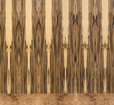
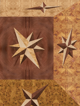
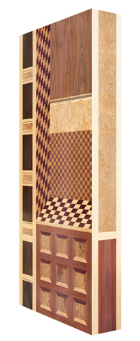
Palace Wall
2008–2010, acid catalysed varnish, wood veneers, medium
density fibreboard, plywood, welded aluminium frame, 210 x
120 x 6 cm
Fabrication with Josef Schranzer
Signed and inscribed reverse with title, date, catalogue no.
MMLVII |
|
No
Man is an Island
Reflections on 'The Great Walls'
|
|
No man is an island, entire of itself;
every man is a piece of the continent, a part of the main.
John Donne (1573-1631)
|
My first studies for The Great Walls found their embryonic
expression in January 2001, so a decade has passed during which
these sketches were elaborated upon, developed into orthographic
drawings and digital drafts, and finally, manufactured. For a creative
context, my initial ideas flowed from the large-scale wall drawings
I was then exhibiting, which were part meditations on the formal
and metaphysical expansion of pictorial space, and the
rejection of the confining influence of the frame. I was intrigued
by the prospect of the gallery wall becoming a principle player
along with the drawing, which might allow for multiple and more
mysterious interpretations of the finite. Predicated on those interests,
The Great Walls has resonances of the projections, flows,
and visual arrestments that then occurred. The final panels and
high-relief wall pieces (in situ) have become windows, views, and
frameworks punctuating architectural space, and trompe-l'il and
conceptual extensions of it (the relationship, then, is not just
spatial, but metaphoric, symbolic, narratively based).
|
 |
The
artworks are also inspired by and derive their meaning, structure,
or content from the architectural element, largely, but not
above all else, the wall — halls, courtyards, pilasters,
coffers, columns, towers, and the like. They are also poetically
conditioned by systems of matching veneer and the material
character of woods — their grains, patterns, and features
governed by growth and cutting method — and, of course,
are technical and material adaptations of intarsia and marquetry
as seen in furniture and, not surprisingly, wall decoration.(1)
In development — as the themes and parameters of the
exhibition became clearer and more layered — it was
evident that the artworks were also the fruit of an association
with my father Josef Schranzer (born 1937, St Paul im Lavanttal,
Austria), a cabinetmaker, and a posthumous association
with Henry Moore, my maternal grandfather (born 1879, Manchester,
England), who was working as an engineer’s patternmaker
as early as 1901. This ‘alignment’ was increasingly
tied to the adoption of forms used by Schranzer and Moore
in their joinery and object making practices, reflecting the
traditions of their trades and their creative attitudes between
the 1940s and 1960s. Moreover, it entailed a physical collaboration
with Josef Schranzer in manufacturing the panels, quite appropriate
as the exhibition progressively floated itself on the converging
currents of self, family, and culture — the ‘passing
on’ of patterns, decorative schemes and standards, creative
forms, languages, and impulses which would thread the historical
and the contemporary, the personal and the collective. So
these associations cum collaboration lay a significant aesthetic,
conceptual, and practical foundation.(2)
Implicit in these flows through history, in those interpretations
and inventions, for instance, of my own father who trained
as a cabinetmaker in the 1950s, through his Tischlermeister,
who was in turn taught by his Master in carpentry, and so
on, are issues of authorship and originality, and the replication
and reinvigoration of both style and tradition. This generational
transmission finds a parallel in the history of Islamic geometric
decoration, with its basic shapes or ‘repeat units’
arranged in different permutations or from which more complicated
patterns were constructed. They were, over time, copied, developed,
transformed, and applied in any number of increasingly complex
(and mathematical) ways to fill and link space, and to increase
variety and visual effects. Intrinsic too, is the notion that
designs may simply become part of a visual and aesthetic identity,
acquired, reordered, and revealed in one’s own art making
through an ‘aesthetic osmosis’ — ergo it
is not so much a question of ‘borrowing’ the extrinsic
but of ‘expressing’ the instinctive. In this sense,
John Donne’s words might well be appropriated for the
creative type; that no man is a creative island, entire
of himself, but a piece of the whole.
Tied to this is the universality of certain motifs, patterns,
and schemes across cultures. However mediated by style, setting,
materials, and technology, these motifs and visual orders
have an elemental and collective resonance. Checkerboard,
diamond, cube, Greek-key and simple repeat patterns extending
to complex tessellations through isometry can be found in
Tribal and Folk Art, Greek Geometric phase pottery, on the
floors of Ancient Roman villas, on the walls and ceilings
of the Alhambra, and within C20th abstract painting. Many
basic forms and patterns are part of (or interpretations of)
the phenomenological world, and this ‘taxonomy’
of forms and arrangements satisfies practical, formal, and
psychological needs (for instance, the recognition and familiarity
of shapes and simple repetitions are a suitable way to hold
a viewer’s attention and allow the eye and mind to roam,
yet be controlled). Further, they can accrue meaning and therefore
play symbolic roles. |
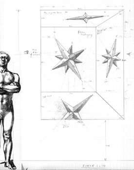
Study
for Star Walls (The Soul's Antechamber)
2007, (detail) pencil on graph paper
|
 |
Study
for Star Walls (The Soul's Antechamber)
2007, 2nd digital version
|
|
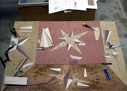
Work
in progress on Star Walls (The Soul's Antechamber)
Dunheved, NSW, June 2008
Photography: Kurt Schranzer |
In The Great Walls these schemes are clearly evident
— checkerboard, cube patterns, and stars — for
they are very much a part of my father’s traditions,
broader visual traditions, and through exposure, mine. Of
course, it is interesting to note that despite the cultural
importance of certain motifs and geometric patterns, it is
also true they have had greater prominence during certain
periods within a given culture or within certain disciplines
such as architecture and the industrial arts. Oleg Grabar
(in The Mediation of Ornament, six lectures delivered
at the annual A. W. Mellon Lectures in Fine Arts at the National
Gallery of Art in Washington, 1989) writes of geometrically
based patterns being “relegated to a relatively limited
role in Western Painting and Sculpture from the Middle Ages
onward, except for mosaic and other tessellated floors of
Southern Italy and for marquetry and other techniques of applied
and industrial arts….” They only resurface as
a potent expression in the post Cubist world, particularly
in the works of Escher, Mondrian, and hard edge, non-objective
abstraction. |
|
| Exempting
the Islamic world, Grabar largely sees them as being more frequently
associated with “areas of creativity [such as textiles] in
which functional purpose dominates the fashioning of the objects,
where craft predominates over art,” and as the preserve of
“the illiterate, the remote, the popularly pious, …women”
or creative orphans such as Escher who sit uneasily within the “pantheon
of contemporary artists.”
|
| Thankfully,
pollination between disciplines and styles is a given within
the contemporary art world, and there is little argument about
the potency of geometric minimalism and abstraction as expressed
in 20th century and contemporary art. Further, postmodern
art is less embroiled in the ‘class’ association
and snobbery between the High and the Low — to the use
of certain forms and the use of techniques like embroidery,
weaving, knitting, or inlay — which leads me to the
point that I am quite interested in blurring the customs and
grammars of Fine and Applied Arts: my paintings circa 1990
incorporated wood veneers, and my drawings over the last 15
years have used the tools of engineering drawing.
One trusts, of course, that this mix of the technical, decorative,
artistic, and creative, has been well advanced within The
Great Walls. Broken Column, for example, was
developed from Henry Moore’s early 1940s hexagonal and
dodecagonal receptacle for knitting needles, capped (he was
a Freemason) by a pyramid. Translated into a tapering octagonal
prism — a final aesthetic and structural synthesis,
for me, of all these Euclidean prisms and energies —
it is funereal, austere, masculine yet emasculated, in a state
of ‘crossing’ over; sinking into the wall of the
gallery and by implication entering a hidden, alternative,
or higher dimension, perhaps redemptive. It evokes time’s
passage and the connections (both concrete and dissolving)
we have to ancient cultures and architectural relics. Its
awkwardness is also reminiscent of unsettling features within
Mannerist architecture such as Michelangelo’s vestibule
of the Laurentian Library, Florence, where — beyond
the broken pediments, blind niches, and strangely cascading
stairway — the pilasters of the niches taper downward
and the columns sink into the vestibule’s walls. It
is for such an interpretation — for these kinds of allusions
— that I speak of myself (and this exhibition) being
conscious of, and alive to, the architectural element. It
is also obvious how the gallery wall becomes an important
player metaphorically and conceptually: the ‘sinking’
nature of the artwork is only made possible by the wall it
disappears into.
Likewise, the gallery wall is fundamental to the narrative
of Porthole Wall. Logically placed at eye level,
the circular windows recreate the below-deck opportunity for
a much-needed-yet-limited view of the world, and the wall
itself legitimately expresses a boat’s hull and corridor.
Together they hint at the long horizontal lines and nautical
elements of the ‘streamline moderne’ style of
the 1930s. Needless to say, Porthole Wall promises
a contemplative glimpse of a soft horizon and an expanse of
ocean, or, as the artwork (in situ) is in close proximity
to the Nepean River, it may well reflect a diverted channel
— a metaphysical tributary — of it. The frames
for the tondi are copies of those my grandfather Henry Moore
manufactured during the late 1940s, to this day still encasing
reproductions of great Master paintings.(3)
|
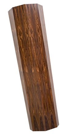
Broken Column
2009–2010, acid catalysed varnish, wood veneer,
plywood, aluminium channel
Installed dimensions 218 x 100 x 31 cm
Object dimensions 210 x 62 x 31 cm
Fabrication with Josef Schranzer
Signed and inscribed reverse with title, date,
catalogue no. MMLIV |
|
 Porthole Wall
2009–2010, acid catalysed varnish, wood, wood veneer, medium
density fibreboard
6 units, each unit 19 Ø x 3 cm, installed dimensions variable.
Fabrication with Josef Schranzer and Darren Clark
Signed and inscribed reverse with title, date, catalogue no. MMLXV |
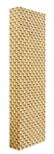 |
Left:
Thatched Tower
2007–2010/2015, acid catalysed varnish, burned matches, wood
putty, wood veneer, plywood, welded aluminium frame, 215 x
64.5 x 22 cm
Fabrication with Josef Schranzer
Signed and inscribed reverse with title, date, catalogue no.
MMLXI |
|
Various essences are at play in Thatched Tower, which
was constructed with over 28,000 burnt matches. Aesthetically
it is modernist, materially it evokes the medieval, structurally
its monolithic quality aligns itself to ancient architectural
posts and the heavy upright stones of megalithic portal graves,
even Romanesque towers. Not impossibly, it is a cross without
its crossbar.(4) Early crosses in swastika-form may well have
been a representation of sticks used to kindle fire, so coincident
with my use of matches, the artwork has become a symbol of
the burning pyre and cross, and within its flames, the heretic
at death. Associatively, it toys with the word faggot,
pejorative slang for homosexuals and the bundle of sticks
or branches tied together and used for fuel. Fire and faggot,
the punishment of the outsider and heretic! The use of matches
and checkerboard pattern is drawn from a corner table built
circa 1967 by Josef Schranzer.
Thatched Tower, therefore, makes numerous historical
and architectural references and clearly appropriates patterned
schemes that my father has used, but it also pointedly engages
with ‘the personal’, enmeshing to greater or lesser
degrees — and, for any of these artworks, according
to expressive need — the political, the humanistic,
the sexual, and the spiritual or esoteric. This conjunction
is evident in Star Walls (The Soul's Antechamber),
where the panel functions as a window into a small room, an
antechamber, with four stars. Again, this work draws upon
the familial: cabinets made by my father, their doors having
star designs which for Alice in her looking glass might well
open to new worlds. Of course, these stars have their own
long history, adapted from the mariner’s rose compass
and old maps, finding their way into quilting, marquetry and
inlay practices. Yet, the panel is more than this sum: it
alludes to a text I have often interpreted from the Egyptian
Book of the Dead: “I am a child of earth and of
starry heaven, but my race is of heaven alone.” It is
a little window into a stellar soul. My stellar soul.
The double-panelled Forest Wall, Bavaria (for the Brothers
Grimm) constitutes a place of rather nightmarish proportions;
trees anthropomorphized into a blockade of ominous sentinels.
It uses the metaphor of the wall for its expressive power.
I am reminded of Leonardo’s proposition that “it
should not be hard for you to stop sometimes and look into
the stains of walls, or ashes of a fire, or clouds…
in which... you may find really marvellous ideas,” an
activity synonymous with my childhood history and visualizations.
The character and beauty of wood speaks for itself and the
panels are allowed to develop that ‘marvellous idea’
into life; the trees transform into the distorted skulls of
horses or antelopes, and their strong nasal cavities soon
become the vulvae of shrieking harpies.
|
|
| |
Forest
Wall, Bavaria (For the Brothers Grimm)
2008–2010/2015, acid catalysed varnish, wood veneers, medium
density fibreboard, plywood, welded aluminium frame
2 panels 220 x 120 x 6 cm, overall dimensions 220 x 240 x 6 cm.
Fabrication with Josef Schranzer
Signed and inscribed reverse with title, date, catalogue no. MMLV
Above right:
Forest Wall, Persia
2008–2010/2015, acid catalysed varnish, wood veneers, medium
density fibreboard, plywood, welded aluminium frame
220 x 120 x 6 cm. Fabrication with Josef Schranzer
Signed and inscribed reverse with title, date, catalogue no. MMLVI
|
Simple in design, but complexly fusing themes of culture, history,
place, and the architectonic, Forest Wall, Persia makes
reference to the land of Iran though more broadly alludes to Mesopotamia,
the ‘land between the rivers’ (Tigris and Euphrates)
corresponding to Iraq, parts of Syria, Turkey and Iran. It evokes
palm trees, the cane-breaks of the marshlands, and forest-rivers
and floodplains. It also suggests palaces set in walled gardens,
since the Babylonians and Assyrians planted fruit trees in their
courtyards and temples to recreate the concept of paradeisos,
Paradise and the Garden of Eden. It calls to mind the famed hanging
gardens constructed not at Babylon, but at Nineveh by the Assyrian
king Sennacherib. I am mindful of the Babylonian and Assyrian
sacred tree, and semi-engaged columns imitating the trunks of
date palms, the columned palaces at Persepolis, Nimrud, Khorsabad,
and Nineveh; especially Nebuchadnezzar’s throne room façade
(restored and housed in Berlin’s Pergamon Museum) with its
four tiled palm trees.
Reflecting on the ancient Chaldæan art of enamelling on
bricks and tiles carried on by the Susians, Persians, and Babylonians
— the great Palace of Darius at Susa with its tiled lion
friezes, winged sphinxes, and rows of archers, and Nebuchadnezzar’s
Ishtar Gate and Processional Way — Processional Wall
can be interpreted as a re-presentation or homage to such decorative
architecture. Yet, without its splendor — stripped of its
bas-relief elements, with an austerity and melancholy pervading
the artwork — it is also in keeping with the awkward spatial
projections and the ‘stillness’ of both Italian mid-15th
century Annunciation painting and 20th century Metaphysical painting.
Secret Window also announces historical debts to the
staged and stilted spaces of Proto and Early Renaissance painting
(Duccio, Monaco, di Paolo, Giotto, and later Uccello). Through
a window, the checkerboard path of a hortus conclusus,
an enclosed garden, is tilted upright in a nod to 20th century
abstraction, and beyond the courtyard, the grain of walnut veneer
(upper-right) suggests a row of Cypress, Poplar, or Pine trees,
the latter common in the background of Madonna paintings. It is
a mannered amalgam, the artwork advancing and intruding into physical
space while its projective illusionism leads our eye into pictorial
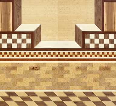
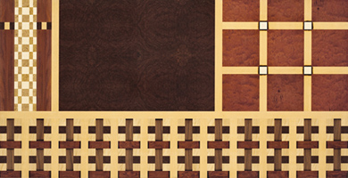
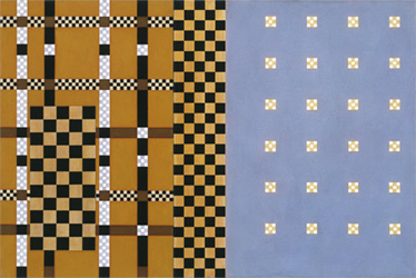
space. Palace Wall is another busily patterned work that
references interior spaces and courtyard enclosures, whilst The
Great Hall, Egypt is a more stern, unadorned architectural
description whose columns and wall — reminiscent of peristyle
courts and hypostyle halls — plays a subtle game, shifting
between salient and recessive positions.
|
 |
 |
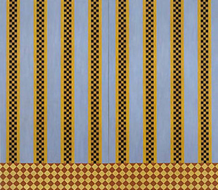
| Processional
Wall
2008–2010, acid catalysed varnish, wood veneers, medium
density fibreboard, plywood, welded aluminium frame, 2 panels
220 x 120 x 6 cm, overall dimensions 220 x 240 x 6 cm. Fabrication
with Josef Schranzer
Signed and inscribed reverse with title, date, catalogue
no. MMLVIII
Right:
Secret Window
2009–2010, acid catalysed varnish, wood veneers, medium
density fibreboard, plywood, welded aluminium frame, 210
x 90 x 25 cm.
Fabrication with Josef Schranzer
Signed and inscribed reverse with title, date, catalogue
no. MMLIX
|
|
Woven
Wall (alongside Broken Column and Thatched Tower)
is one of the more reductive and abstract artworks on exhibition,
relying on a simple geometric repeat pattern based on woven baskets,
yet it too might be read as part of an edifice, an interpretation,
perhaps, of the glazed tiles and brick patterns of Mesopotamian
architecture. The repeat configuration (also adopted in
an early painting The
Alchemist, 1992) draws upon a circa 1960 jewelry
box made by my father. Its technique of scorching or burning veneer
with hot sand (to shade or suggest roundness) is an established
process going back to the 15th and 16th centuries. This technique
was also exploited in Window to the Universe, with its
pulsating stars and gridded and woven pathways constituting, perhaps,
some new hypothesis or explanation or offshoot of mathematics and
quantum super-string theory, contrasted with its burl walnut heart
articulating the unfathomable mysteries and nebulous nature of the
universe. Does it only question, or does it posit and mirror theoretical,
natural and esoteric laws, expressed in symbols and geometry?
|
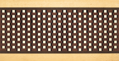
Woven
Wall
2008–2010, acid catalysed varnish, wood veneers, burned
wood veneer, watercolour,
medium density fibreboard, plywood, welded aluminium frame,
120 x 235 x 6 cm
Fabrication with Josef Schranzer
Signed and inscribed reverse with title, date, catalogue no.
MMLXIV
|
As
abstract investigations these latter works search for many
syntheses, and ideally aim to be revelatory of the archetypal,
and the deep and fundamental, sublime nature of things: Window
to the Universe, for instance, seeks to express the universe’s
connective threads; it’s fabric. Quoting art historian
Charlotte Douglas (Pamela Schaeffer, ‘Spirituality in
Art’ in Christian Century, 1987), such abstract
language has been prompted by a need for new dimensions of
consciousness, suited to “‘serve as a passport
to and report from’ the so-called higher realms.”
Intrinsically, it is linked to the desire for a universal
metaphysical lexis and, if we borrow a term from Schwaller
de Lubicz,(5) Window to the Universe attempts to
express "symbolique" or the "Language of the
Gods," using symbols as letters in an alphabet that makes
sense of both scientific and esoteric realms; reflecting spirit
manifesting into matter and their harmonic relationships,
underpinned by the pandeist’s belief that the Universe
as God took physical form in order to experience
the being and the play between the elements of the universe
(that is, itself).
As part of that abstract language, these panels build upon
a visual and conceptual base evolved in earlier wall drawings,
as well as painted and pencilled artworks from The Great
Library series (circa 2000), which developed from collaborative
drawings made with the artist Joe Frost (b. Sydney 1974),
who in turn had drawn inspiration from Agnes Martin’s
abstract drawings and paintings. Some of these panels also
hold resonances with the work of Andrew Christofides (b. Cyprus
1946), a contemporary and colleague. I make note of these
facts to further illuminate the connective threads that operate
between artists, or generations, within and across various
traditions.
|
Window
to the Universe
2008–2010/2015, acid catalysed varnish, wood veneers, burned
wood veneers, watercolour,
medium density fibreboard, plywood, welded aluminium frame,
120 x 235 x 6 cm
Fabrication with Josef Schranzer
Signed and inscribed reverse with title, date, catalogue no.
MMLXIII
|
|
| In
the case of Christofides, it is no surprise that patterns
and compositional devices within Window to the Universe,
and segments of Palace Wall, strike visual chords
with his paintings. In An Interview with Artist Andrew
Christofides (2008, geoform.net), Christofides speaks
of his works having links to the Italian Renaissance and “the
early European utopian movements — Suprematism, De Stijl,
Constructivism,” though his geometric sources are enmeshed
quite broadly, “initially [arising] out of [his] game
sequence paintings of the mid 70s,” an early empathy
with Paul Klee’s paintings of “irregular checkered
patterns of color”,(6) later of antique maps, and more
recently the “gridded excavations of ancient architectural
foundations” and icon painting. Over the years, and
through many subtle transitions, his work has always retained
the significant motifs of the checker and grid, which are
also elemental patterns found in weaving, marquetry, mosaic,
and architecture. It is true to say that for both of us, checkers,
grids, and basic repeat patterns have been passed through
personal and cultural filters, and (whether major or intermittently
used motifs) have become our own.
|
Andrew
Christofides, Echoes, 2006
acrylic on canvas, 40.5 x 60.5 cm
|
|
It
is interesting to note that as I was mindful of his paintings when
constructing Window to the Universe and Palace Wall,
Christofides was to make use of the composition from the digital
study for Forest Wall, adapting it to his usual geometric
abstractions in Study for Pantheon: after Kurt, and Pantheon:
after Kurt I and II, produced in 2007 and 2008. These
kinds of pollinations are a wonderful tribute to art and visual
form and the subconscious or seminally conscious transmissions that
can occur; communicating the visual pull and hold that ‘things’,
‘objects’, and ‘designs’ can have; reminding
us of the expressive, compositional, stylistic and aesthetic continuities
between family generations, artists, genres, and applied and fine
art traditions. I use the analogy that artists and their creative
trajectories are part of a cloth that is woven, knitted, embroidered,
even complexly knotted. It is romantic and indulgent to think of
our selves in a vacuum — as creative orphans or geniuses —
beyond the forces of evolution, untouched by voices that, in a sense,
are ours already. No man is an island.
|
Study
for Forest Wall, 2007, digital study
|
Andrew
Christofides, Pantheon: after Kurt II, 2008
acrylic on canvas, 213 x 244 cm |
|
Though I take Philip Guston’s words out of context in his
dialogue with Harold Rosenberg (Philip Guston’s Object,
a Dialogue, 1966 interview), his statement is a fitting address
to these confluences, influences and the development of forms: “It
has to be new and old at the same time, as if that image has been
in you for a long time but you’ve never seen it before. When
it comes out, [you] must have this double experience in yourself.
I can’t accept something which is so new that there’s
no recognition of myself in it.” In all this absorbing and
reconstituting, there is a sense of taking and making something
old, something new… slipping on a coat owned by many
that sits beautifully, comfortably, uniquely moulded, at one with
the self.
Kurt Schranzer
March 2011
NOTES
1. Marquetry, inlay, and intarsia have been used to embellish walls,
furniture, boxes, reliquaries and ceremonial regalia. Their traditions
go back to ancient Egypt, Rome, and Persia, finding strong expression
in 13th–16th century Italy and Germany. Examples might emphasise
vegetal, zoomorphic, abstract and geometric schemes, or showcase
complex pictorial and perspectival effects. Intarsia and marquetry
are similar. The technique of intarsia — derived from the
Latin interserere “to insert” — inlays
selected pieces of wood (or ivory, metal) within a solid matrix,
or more often, by individually cutting, shaping, and sanding separate
pieces of wood and fitting them together on a surface like a jigsaw.
By contrast, marquetry is the gluing of a pattern of thin veneers
upon the wood carcass.
2. Suffice it to say, working together with my father has time and
again elicited the question “What is it about fathers and
sons?” as if the undertaking has been one of romantic and
symbolic reconciliation and reconnection — an unfolding story
about prodigal and penitent sons. This thinking underestimates the
complexity of my intent.
3. A tondo (plural tondi) is a circular painting or relief, and
is often used to describe the circular representations of Madonna
and Child that are characteristic of the Florentine school from
the mid–15th to the early 16th century.
4. Crosses may have a single or double crossbar, in numerous stylistic
and structural variations, for example the Tau cross, St Peter’s
cross, the Lorraine cross, and the Greek cross. The artist can easily
adopt, adapt, or create an entirely new ideograph without prior
convention to meet personal and symbolic needs.
5. René Adolphe Schwaller de Lubicz (1887–1961) spent
15 years studying the art and architecture of Egypt’s Temple
of Luxor, publishing the book The Temple of Man, pursuing
the link between the cosmic and terrestrial realms, and focusing
on alchemy, physics, mathematics, sacred geometry, art, astronomy,
and symbolism.
6. Here, Christofides refers to Paul Klee’s ‘magic squares’
paintings, for example Ancient Sound, Abstract on Black;
Harmony in Blue and Orange; Abstract Colour Harmony.
Many were painted in the 1920s, with their rhythmic chromatic relationships
expressive of polyphony.
|
| |
| |
| |
|
Photo
credits: Jennifer Leahy, silversalt photography, 2010, unless otherwise
attributed
Andrew Christofides' images courtesy of the artist and King St Gallery
on William, Sydney, © Andrew Christofides
© Kurt Schranzer 2011 |
|